
By: Patrick Sauriol Sep 12/2023
Green Energy Landing Pages for your Marketing Strategy
In an earlier Snaptech blog post, I addressed what some of the gaps are in the marketing strategy for green energy companies. Snaptech has worked with several established and start-up green tech firms that are seeking to carve out market share online. Our experience in marketing green energy has given us some insight into the good and the bad of trying to capture the attention of this savvy audience. Creating a landing page for a green energy service or product requires some finesse and specialization than the typical landing page, though some elements are consistent from both worlds. This can not only impact your overall marketing strategy and design of your website, but it can also impact how successful your content marketing really is. If the content is not easy to read or look at, you are likely going to lose customers and any goodwill he landing page or blog may have brought to your website.
As part of our month-long focus on examining landing pages and their importance to an overall marketing strategy, let’s spend some time looking at the nuances of constructing a great landing page for these eco-conscious companies.
Compelling Headline and Sub-Headline for Landing Pages
Headings are the first thing visitors see when they land on your page. In the case of a clean tech business, your headline should state the benefit of whatever service you offer, or of the product you’re selling in the green energy space.
Example: For a business installing solar panels for homes, make it plainly clear what the homeowner’s primary benefit is. “Save Money By Using Solar” gets the point across to a homeowner hoping to save on energy costs. “Clean Energy From Coastal Waves” speaks to the corporate crowd hoping to align their company’s energy demands with a non-polluting energy source. While “Clean Countertops Without Chemicals” can speak to the home cleaner worried about the chemical cocktails found in traditional industrial cleaning products.
The sub-headline should provide a bit more detail and reinforce the headline’s message. That’s where you can dive a little deeper into how the service/product is going to improve the customer’s everyday lives.
We also want to make clear what is the primary header, also known as the H1 and the sub-headers, often referred to as H2’s, H3’s, etc. The primary header should convey the primary topic and include your primary keyword or topic within it.

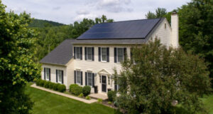
Engaging Visuals
The visual elements of a landing page are critical, especially the hero image the site visitor will see above the fold.
You want to choose an image that marries the headline to the green product or service. Good photography is critical for your green energy company; spend the money on magazine-quality imagery of the solar panels, wind turbines, or hydropower facilities your business relies upon.
In addition to clear images of the product or service, have photography showing the end user benefits from the green tech. Don’t forget to consider using graphics to illustrate benefits, such as graphs showing the amount of reduced carbon emissions, energy cost savings, healthier lifestyle results, and so on.
Clear Call-to-Action (CTA) for your Landing Pages
The primary goal of every landing page is to convert visitors into customers or leads. When you choose the copy for your CTA, make the wording clear and compelling; it’s about taking action in the moment for the user and in the bigger picture of the environment.
Instead of obvious choices like “Get Started,” “Request a Quote,” or “Learn More”, think about tying your CTA to a high-level environmental picture. “Make the Right Choice” plays more into this eco line of thought than “Add to Cart” does.
Finally, the colour of what your CTA button should be. Obviously, a contrasting colour that draws attention to the CTA is your first intention, but just as important to that is making that CTA colour be a companion to the page. If you’re green energy company relies on greens, blues, and whites for the company colours, a warm colour like a cherry red could be the optimal choice to stand out on the page. Red usually means concern or danger for a western-minded audience, so make sure that if you do go for a red button colour, that it’s not disconcerting to the visitor. Think more Iron Man amor red and less stop sign red.
Trust Signals
Establishing trust is extremely vital when promoting green energy solutions. The cost of the green product or service could be higher than a traditional one, so instilling a sense of purpose and what the right decision is for the betterment of our world is key.
For this reason your green energy landing page may need more emphasis on testimonials, case studies, and certifications. Highlight any awards or recognition your company has received for its environmental initiatives, even going so far as to include the education and background of your workers as it pertains to the green space fields.
All of this builds credibility and reassures visitors that they are making a wise choice by considering your services, especially if they are making a comparison between your service and a competitor. Every little way that you can raise your prestige matters.
Educational Content
Why not go a step further and consider using your landing page as a mini-source on the problem that you are solving? Providing informative content is an excellent way to educate visitors about green energy, and to possibly acquire links from other websites speaking in the same space.
Consider including infographics, a snippet from a relevant blog post, or links to downloadable resources that explain the science behind your solutions, highlight the positive environmental impact, and spell out the numerous financial benefits one receives from becoming your next customer.

Benefits and Features
Clearly, and I mean really clearly, outline the benefits and features of your green energy solutions.
Some green energy businesses are operating in a technical or overly complex space to begin with. Don’t assume that the audience coming to your landing page are engineers or scientists; they may be the assistant to the decision maker who’s been tasked to find possible suppliers for their issue.
Think of your green energy landing page from the perspective of the lay person. Explain in a non-technical manner how your solution helps customers reduce their carbon footprint, lower energy bills, and contribute to a sustainable future.
Consider using bullet points or icons to make the information visually appealing and scannable. And even better, instead of bulletpoints, think about using eco-minded icons: a globe, a tree, a leaf and so on.
User-Friendly Form
If you’re collecting customer information for lead gen, keep the form simple and user-friendly.
Ask for only essential information, such as name, email address, and location. The fewer fields visitors need to fill out, the more likely they are to complete the form. You can always gather more details later in the customer journey.
And add a reminder that the information the landing page visitor provides will be kept confidential. No one wants to be worried when filling out a form.

Responsive Design
Our agency has seen up to 90% of site visits come from a mobile device. With the steady growth of mobile devices to view the web, it’s crucial to ensure that your landing page is mobile-responsive.
If your desktop landing page is packed with info, cast a critical eye on the mobile version of that page. Is the most important or relevant info near the top of the mobile page? Does the contact button or CTA always remain visible?
Google also prioritizes mobile-friendly websites in search results, improving your page’s visibility. That’s why it’s also important to look at the keywords on your mobile LP and ensure that they are in headings and body text.
Social Proof and Statistics
Showcasing statistics related to your green energy company’s impact can be highly persuasive, especially since so many of the green space’s solutions are developing and new.
Share data on the number of customers you’ve helped transition to clean energy, the amount of carbon emissions reduced, or the energy cost savings achieved. Did you have your business featured in a magazine article or a website? Show the logo from that publication, it’s positive exposure. Statistics and press mentions demonstrate the real-world benefits of your services.

FAQ Section
Address common questions and concerns that potential customers might have in a dedicated FAQ section. Don’t make it long; a deeper FAQ can be offered to the page visitor as a reward to filling out the page’s form.
A concise FAQ can help reduce friction in the decision-making process and provide clarity on topics like installation, maintenance, and pricing. It can also gently push the visitor towards becoming a page conversion, i.e. fill out your contact form.
If possible, record short video clips for a more engaging experience.
Contact Information
Make it easy for visitors to get in touch, or better still, gain confidence with your green energy company by displaying your contact information prominently, including phone numbers, email addresses, and a physical address if applicable.
People will be more likely to give your unknown business their trust if you show evidence that you’re legitimate and in the real world.
One other option to consider: incorporating a live chat feature to provide real-time support and answer inquiries. We’ve heard good stories from companies in the green space that have real-time chat support.
A/B Testing and Analytics
I’ve said this in other blog posts, but it bears repeating again: creating an effective landing page is an ongoing process. You are never ever absolutely finished.
Activities like A/B testing provides insight into your marketing. We call it data storytelling here at Snaptech, and it uncovers so much to help improve lead flow and reduce marketing expense.
Use a free tool like Google Analytics to track visitor behavior, conversion rates, and other key metrics to continuously optimize your landing page for better results. Unbounce is another recommended piece of software Snaptech uses.
There is a Science to Successful Green Energy Landing Pages
Crafting an effective landing page for a green energy company requires careful consideration of various elements. It’s like the difference between a general practitioner doctor you go see for an ache and a specialist that focuses their practice on one region of the body: ears, nose, throat; back and spine; neck and shoulders; and so on.
While there are constant elements in all landing pages (combining a compelling headline, engaging visuals, clear CTAs, trust signals, educational content, and responsive design), your goal with a green product/service landing page is to speak on a deeper level to people that are already thinking (or at least starting to think) as environmentally conscious customers.